
Basic Concept of Flexbox For Beginners
In this article, we’ll discuss CSS Flexbox and cover all the basic concepts that will help you to get a good understanding of the CSS Flexbox model.
What is Flexbox?
Flexbox is designed to arrange a group of layouts either rows or columns in one dimension. The Flexible Box Model or Flexbox is basically used for the arrangement and alignment of a group of items or gives a constant layout on different screen sizes.
Why Flexbox?
CSS has always been one of the most important parts of web development and creating CSS layouts everybody is frequently using Floats and Positioning which is a well-founded cross-browser compatible tool including Firefox, Chrome, Opera, Microsoft Edge, and IE 11, newer versions of Android/iOS, etc. But, this has its own limitations that make people frustrated.
Flexbox is the best alternative to overcome floats and positioning. With the help of Flexbox, you can easily design and build responsive web pages without using countless float and position properties in our CSS code. For example;
- Text overlapping
- Content creating Whitespace issues
- Left overlap on other elements
The Flexbox makes a lot of layout tasks much easier like;
- Vertically centering a block of content inside its parent.
- Helps to arrange multiple items/product items in one line/columns/rows
- Making all columns in a multiple-column layout adopt the same height even if they contain a different amount of content.
- It is a set of CSS properties
Let’s discuss them in brief.
3 Main Problems Resolved with Flexbox Instantly:
- Vertical Centering: Let’s first talk about a universal coding problem. Vertical centering is an absolute pain for developers. You’d think that something that sounds so simple would be that way. Let’s take a look at an example.
Below we have a div block with a static height and some content inside of it.

As you can see, we had no problem centering it horizontally with the code shown.
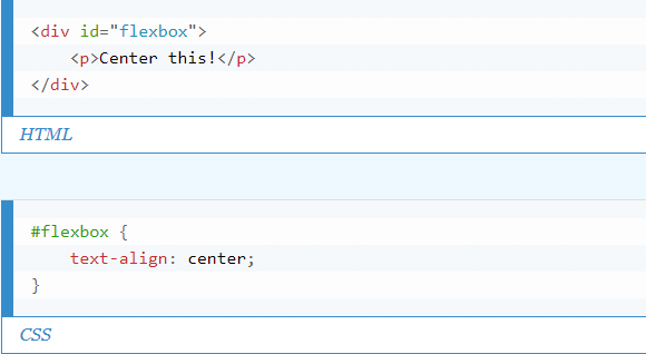
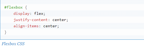
But now we want to center it vertically as well. How would your average developer approach this? Well, I suppose you could give the div a padding-top property. But this is messy and would become a hassle if the div’s height was dynamic or ever needed to change. So after some research, a developer might come to this:
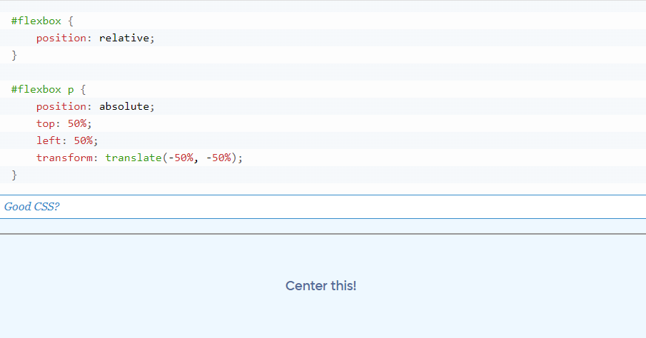
Here we have our div again, but this time with Flexbox code.

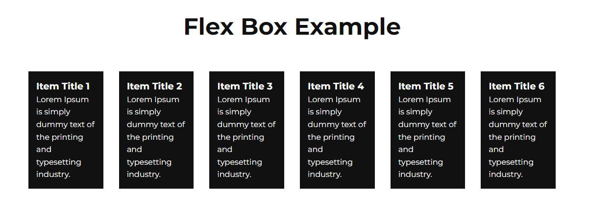
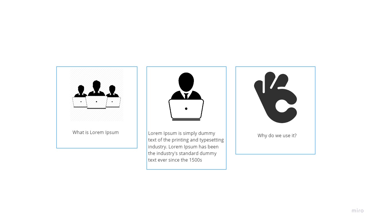
- Match Height: This is the second most important problem faced by developers or designers every time. You’ll have a few objects aligned in the same row, and each one is filled with different content. All of them are going to be of different heights and maybe your designer wanted them all to be the same height. Well, the only way you can do that is to make all the objects in that row equal the height of the tallest one.
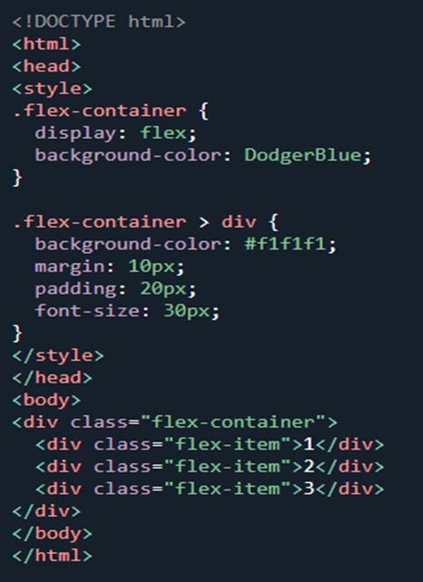
Here we have three different divs each containing an illustration
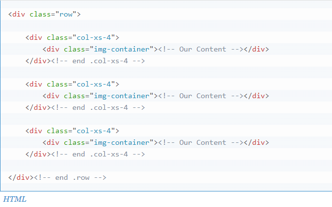
So let’s take a look at the HTML
Before Flexbox, the best solution would be to download a jQuery plugin like match-height.js or equalHeight.js and then target the img-container class in your Javascript file using a function.
That sounds like a lot of extra work for a really small adjustment. And news flash, it is. Instead, we’re going to implement Flexbox in the CSS like so:
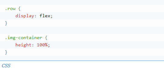
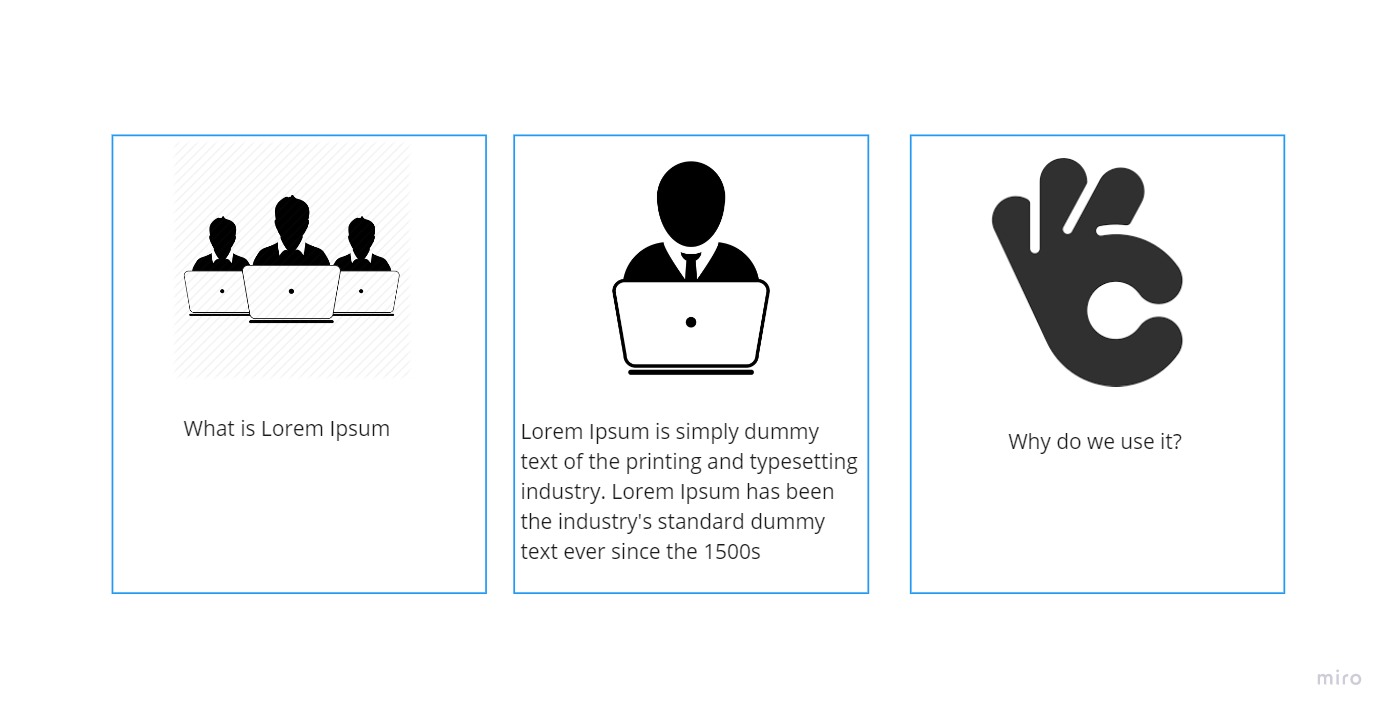
And almost like magic, those two lines of code do everything for us.
- Dynamic Stretching: To create a dynamic page for clients so that if they remove any small portion from the website in the future, they could.
Let’s take the example of a subscription pricing option on the website.
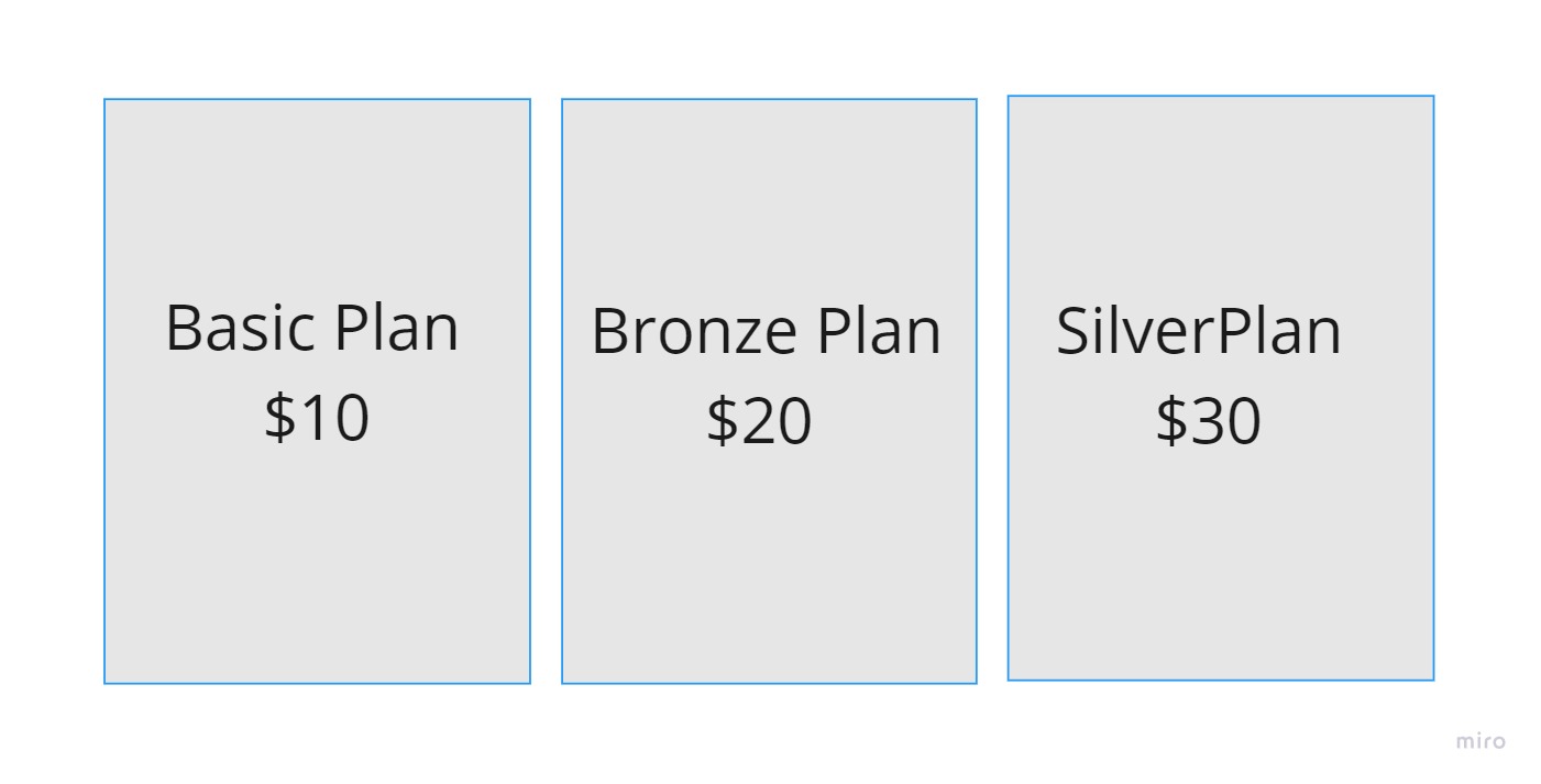
The problem here is that to do this we would need to resize all of the divs based on how many pricing options the client eventually input. Since we built the site on WordPress, this would require a lot of complicated PHP logic.
Now let’s make the assumption that we’re all simple front-end folk here and PHP isn’t exactly on the table. How can we go about doing this?
You guessed it: Flexbox.
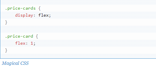
In fact, this is Flexbox’s main purpose. To be able to “flex” children of a parent object to fill in all available space. This means that you don’t need to type up a bunch of back-end coding to get something like this to work. Here’s what the section was to look like if we removed the last pricing option:
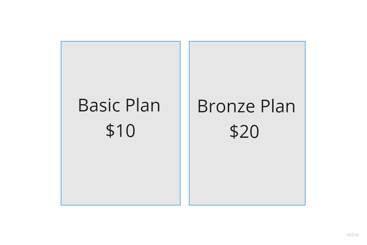
And all we needed in our code was:
Properties of Flexbox:-
- Properties for the Parent (Flex Container)
- Properties for the Children (Flex Items)

Flex Container
(display: flex;)
- Flex-direction
- Flex-wrap
- Flex-flow
- Justify-content
- Align-content
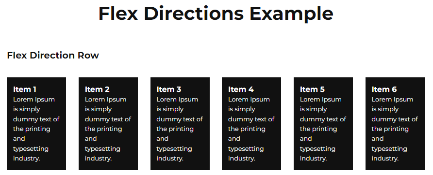
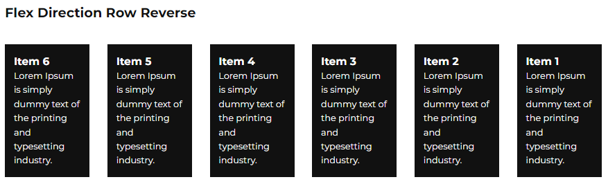
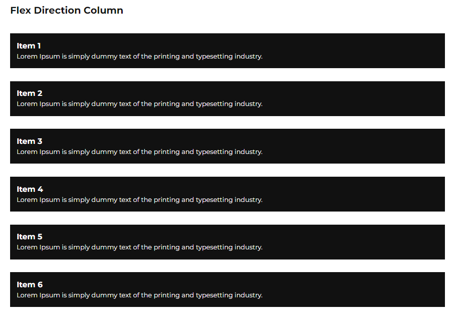
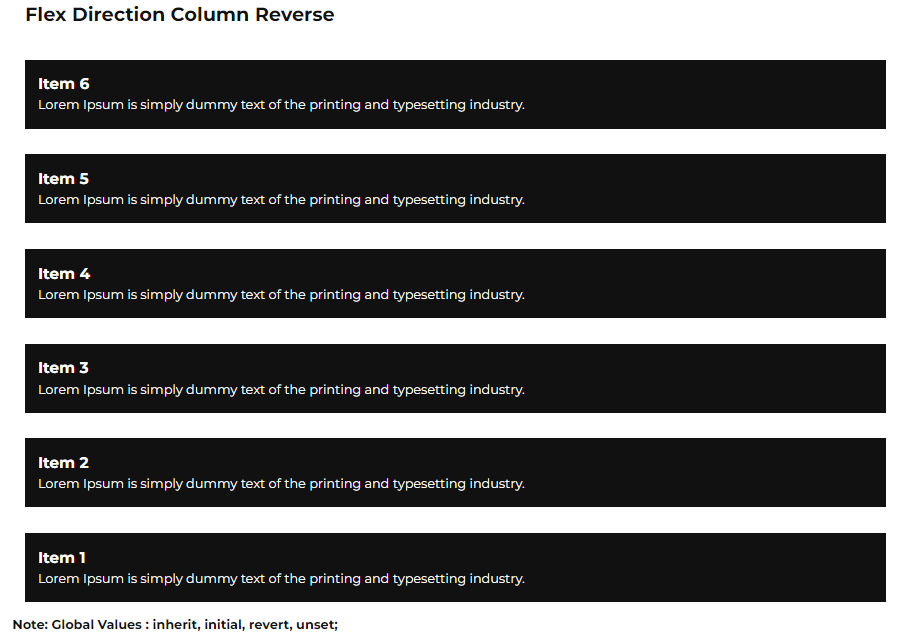
- Flex Direction:
row | row-reverse | column | column-reverse;
For Row: display : flex;
flex-direction : row;
Reverse: display:flex;
flex-direction : row-reverse;
For Column: display : flex;
flex-direction : column;
Reverse: display:flex;
flex-direction: column-reverse;
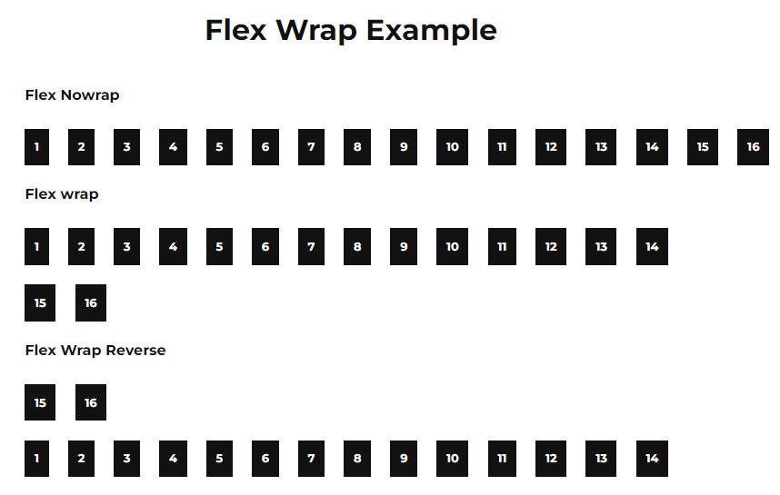
- Flex Wrap:
nowrap | wrap | wrap-reverse
For Flex Wrap:
display : flex;
flex-wrap : nowrap/wrap/wrap-reverse
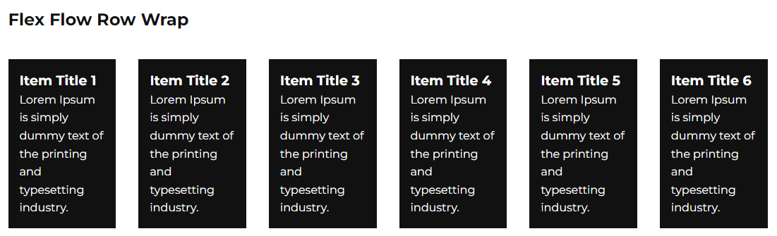
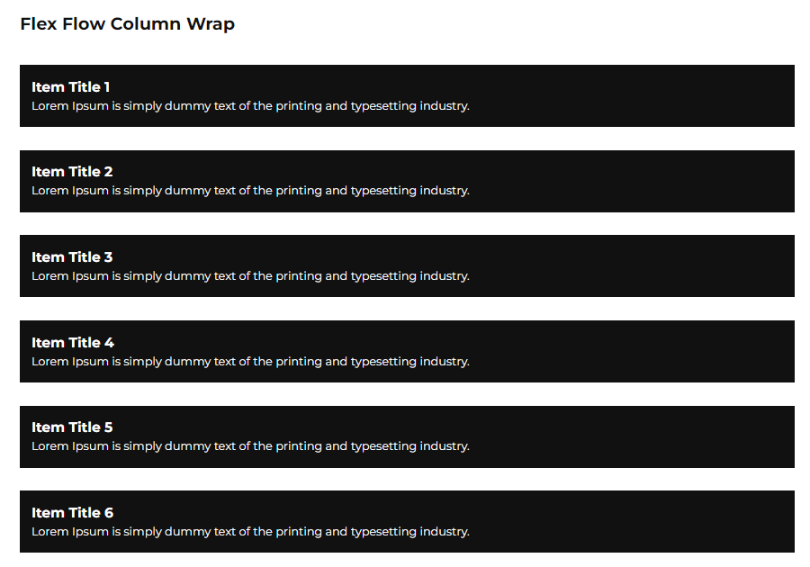
- Flex Flow:
column wrap | row wrap
(Shorthand property for setting both the flex-direction and flex-wrap)
For Flex Flow :
display : flex;
flex-flow : column wrap / row wrap;
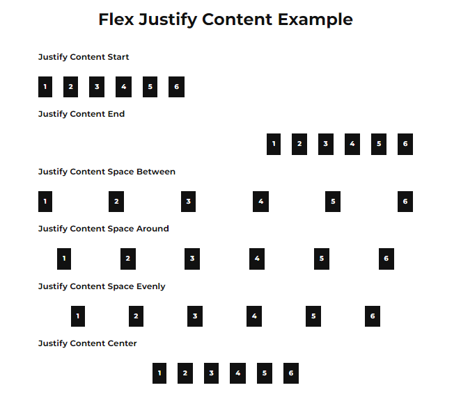
- Justify Content: (Horizontal Align)
flex-start | flex-end | center | space-between | space-around | space-evenly | start | end | left | right | unset | normal | inherit | initial
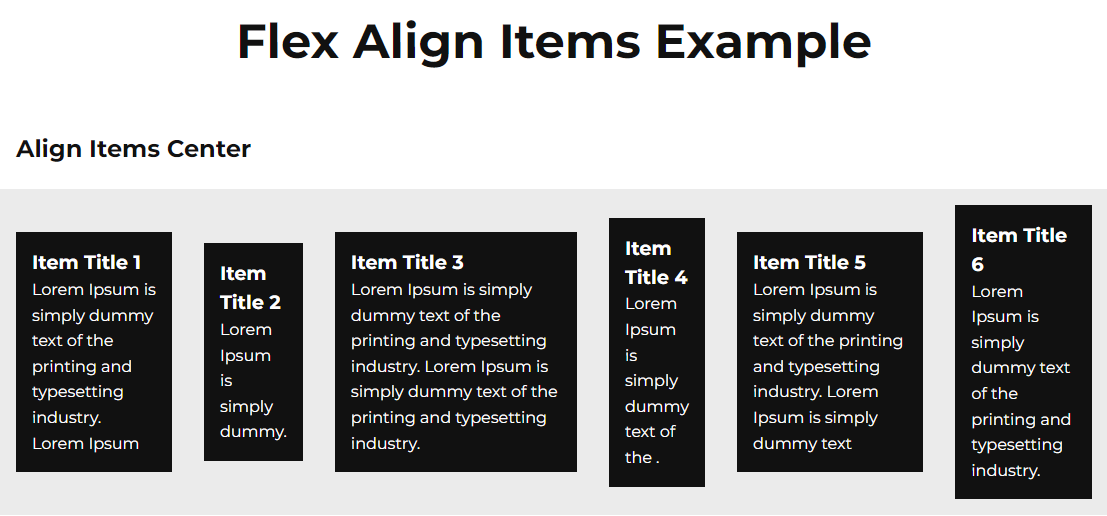
- Align Items: (Vertical Align)
stretch | flex-start | flex-end | center | baseline | first baseline | last baseline | start | end | self-start | self-end
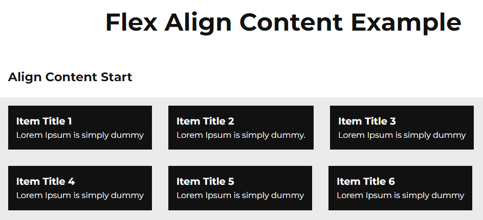
- Align Content:
flex-start | flex-end | center | space-between | space-around | space-evenly | stretch | start | end | baseline | first baseline | last baseline
Flex Items:
Properties for the Children:-
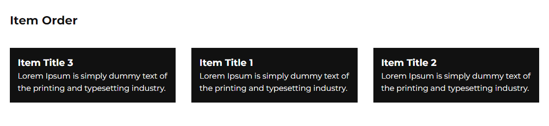
1. Order: Rearrange the order for flex-item
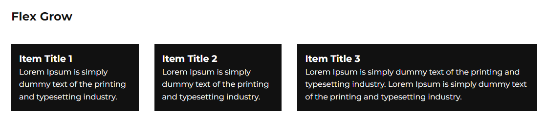
2. Flex Grow: One of the items to grow more than others
3. Flex Shrink: The ability for a flex item to shrink if necessary
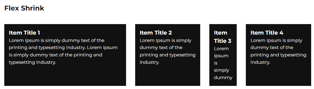
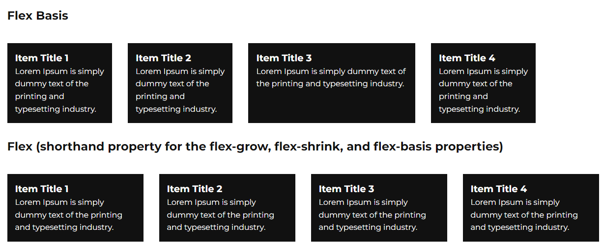
4. Flex Basis: Property specifies the initial length of a flex item
5. Align Self: Property overrides the default alignment set by the container’s align-items property.
Syntax:
order : 1;
flex-grow : 3;
flex-shrink: 2;
align-self: center;
Some Other Properties:
- Gap
- Row Gap
- Column Gap
Reference:
https://icepick.co/coding/flexbox/

Leave a Reply
We'll try to resolve your queries asap.
Recent Posts
22.Jan.2024 | codedrill | Drupal
Drupal 7 to 10 migration services
Hire Codedrill for Drupal 7 to Drupal 10 migration. We also offer complete drupal development services from
11.Jan.2024 | codedrill | Apache, Hosting, Linux, MySQL, PHP
Install php 8.2, mysql, apache, phpmyadmin on ubuntu 22
All the new CMS and frameworks have started support for php 8.2. And it is quite easy to install php8.2 on